

UX Project/Case Study
The Jamba App
Problem Statement provided by Focus Brands
Our analytics show that the cart abandonment rate on our app is through the roof. How do we redesign the app to handle the problem?
My contribution in the team

Project
Documentation

UX Research

User Testing

UX Design
Context of the Problem
Jamba, formerly known as Jamba Juice, is a company that produces blended fruit and vegetable juices, smoothies and similar products. Jamba is owned by Focus Brands.
43%
Users complete an order
4.5%
App sessions lead to a purchase
THE CHALLENGE

We were required to understand the problem and identify the issues leading to cart abandonment. These problems could possibly range from confusing labels and poor information architecture - we were yet to find out!
Process for the Redesign

Phase 1:
Researching Problem Space
Phase 2:
Testing with Wireframes
Phase 4:
Testing Prototypes
Phase 3:
Testing with Mockups
Phase 1: Researching Problem Space
As one of the primary researchers on the project, I contributed in making the research plan and the phase distribution based on research on the existing design and the subsequent design iterations.
Research Methods

Literature Review
(App Reviews and Digital Analytics*)

Why was this method used?
App reviews helped us to extrapolate the popular opinion around
the existing design and also identify the top areas that we could
potentially work on.
What kind of data was collected?
Large amount of qualitative data by parsing through the user reviews & comments on Google Play & App Store.
How was the data represented?
For app reviews, we generated insights based on each review and
coded them according to broad themes to identify the top 10 pain points.
Top 10 pain points from app review analysis & the resulting insights
*For the analysis of the app's digital analytics report, we are bounded by the company's NDA to not disclose any analytical and statistical information.
Task Analysis
User Flow and Hierarchical Task Analysis (HTA)
Why were these methods used?
To visualize the architecture and the cognitive sequence of flow of information on the app.
What kind of data was collected?
How the screens move, transition and the visual hierarchy of the system and an overview of sub tasks.
In the form of user flow and HTA diagram designed using Adobe XD.
How was the data represented?

User flow chart for the Jamba application

HTA for Jamba App
Competitive Analysis
Desk Research, to understand features of other brands and identify gaps and opportunity in the research.
Why was this method used?
What kind of data was collected?
Additional features, ideas, design decisions and validation for our research findings.
How was the data represented?
In the form of features comparison tables presented below.


General Category Analysis

Onboarding Category Analysis

Ordering Category Analysis

Checkout Category Analysis
Online Survey
To quickly gain quantitative data based on order-ahead
app usage.
Why was this method used?
Quantitative data from 53 responses.
What kind of data was collected?
DISTRIBUTION PLAN
In the form of pie charts, tables and graphs, etc.
How was the data represented?
SLACK
SURVEY DESIGN

Survey design
Each question on the survey had response options that best represented the rationale behind the question. The table below lists down the response options and the rationale behind every question on the survey section wise. The full version of the table can be seen after clicking on it.

Click on the table above to read the full table about every question on the survey
Field Studies
Why was this method used?
To see the reaction of people and get an unbiased view of the user in the user’s own context.
What kind of data was collected?
Insights that helped us in validating our findings by observing the users in the context.
How was the data represented?
In the form of an observation table with notes and interpretation for every note.
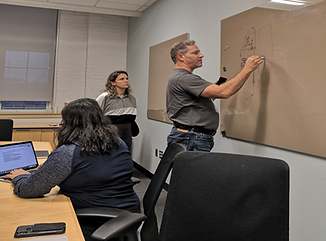
Location: Jamba Store in Tech Square, Atlanta.
I followed the Fly on the Wall technique, where I sat in one corner of the store and observed 4 people and took notes.


Observation session in
progress at Jamba Store
Contextual Inquiry

Why was this method used?
To acquire feedback on the existing application directly from the users in context.
What kind of data was collected?
Qualitative and quantitative data on the usability of the app by observing users perform a given task.
How was the data represented?
In the form of answers to interviews questions and SUS scores after the task. I interviewed 2 out of the 7 interviewees.
Application Walkthrough
We used the Think Aloud protocol to capture the behaviors, thoughts, attitudes, likes and dislikes of the users.
System Usability Scale
We then used quantitative measure of the app's usability to get reliable and valid results.
Semi-Structured Interview
Finally, we followed up with questions to users about the walkthrough & SUS response.


* System Usability Scale consists of 10 questions on industry standard for usability testing; 68 is the national US average.
SUS* Score Comparison
Personas
At the end of the research phase, to get overview and synthesize our research findings, we created 2 distinct personas.


Empathy Maps


Journey Maps


Research Findings from Phase 1
To consolidate our findings from all the research methods, we visualized the issues on a spatial area to figure out where the density is the maximum, based on the area that the sticky notes are most clustered in.
System Usability Scale
Quantitative measure of the app's usability to get reliable and valid results.


Thematic Analysis of Data


Phase 2: Wireframing
To understand the division of the feedback from the contextual inquiry process, we divided the whole process into 3 parts: Sign up, Ordering and Checkout.

Design | Sign up

Jamba App
New Wireframe
Design | Menu View

Jamba App
New Wireframe
Design | Menu View
Design | Order Status


Jamba App
New Wireframe
New Wireframe
Jamba App
SUS Score Comparison
(After testing the Wireframes with users by Contextual Inquiry)

*We did not ask the users to fill SUS for the wireframes, since they are essentially skeletal designs, hence the score remains unavailable.
Phase 3: Mockups
We tested our wireframes with users using Contextual Inquiry method where we gave them 3 representative tasks in each category (Sign-up, Ordering and Checkout) and after the cognitive walkthrough and after the task, we conducted semi structured interview with the users related to the experience.
Wireframes

Contextual Inquiry

Design | Sign up

Design | Review Order

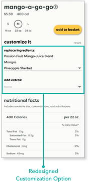
Design | Customizations
Design | Track Order


SUS Score Comparison
Phase 4: Prototypes and Final Evaluation
We tested our wireframes with users using Contextual Inquiry method where we gave them 3 representative tasks in each category (Sign-up, Ordering and Checkout) and after the cognitive walkthrough and after the task, we conducted semi structured interview with the users related to the experience.
Mock ups

Contextual Inquiry


Final SUS Score Comparison

Our final prototype shows a usability score increase of 53% from 60.71 to 92.92
Evaluation of Final Prototype
Heuristic Evaluation with 3 experts


Unmoderated Online Testing at UserTesting.com
We created elaborate tests for remote users to test our prototype. I took the lead in designing the tests for remote users.

(Click on the video for a sample of the testing)
In-person
User Testing at a Jamba Store
We intercepted users at the store and made them do a comparative testing between our prototype and the original app.

Final Takeaways from the Testing

Users spent 29.7% less time finishing each task on our prototype

5/6 users during the testing preferred the customization
visibility on our prototype
To view this project in the form of a slide deck, please visit the link below for the detailed representation -
Click here for the detailed presentation
Problem Statement
How can we improve the Jamba application’s customer journey for new users in order to reduce cart abandonment and increase sales?